Red Envelope Portfolio
Red Envelope is a company that designs menstrual cups for women.
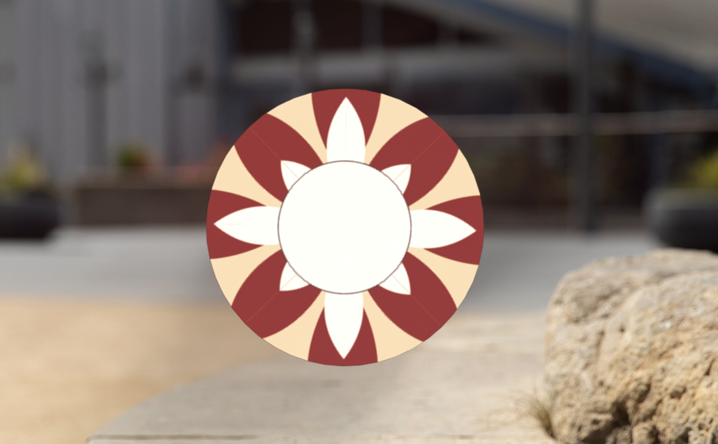
I was tasked with coming up with a design for the typeface and the product the menstrual cup would come in.
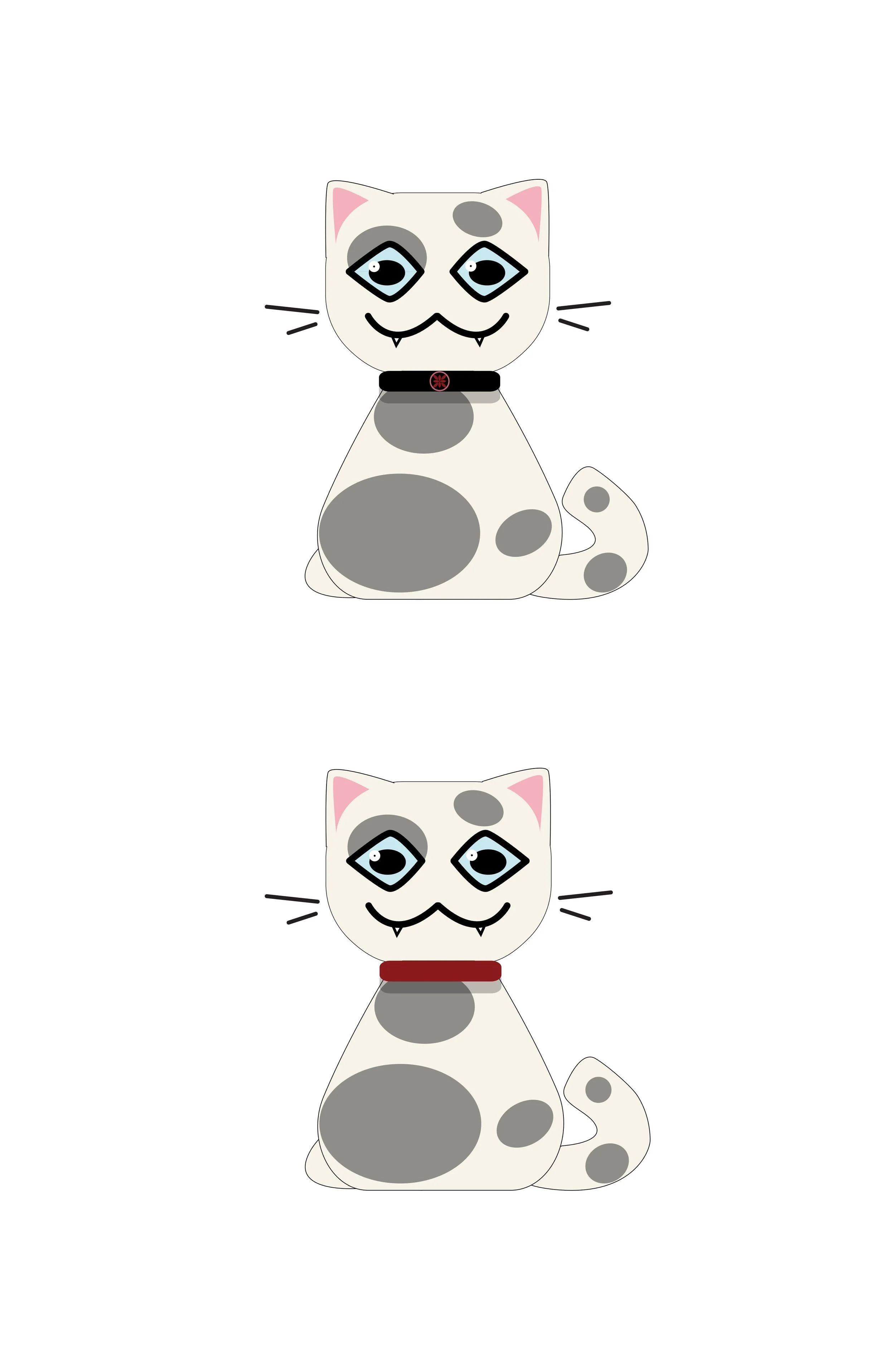
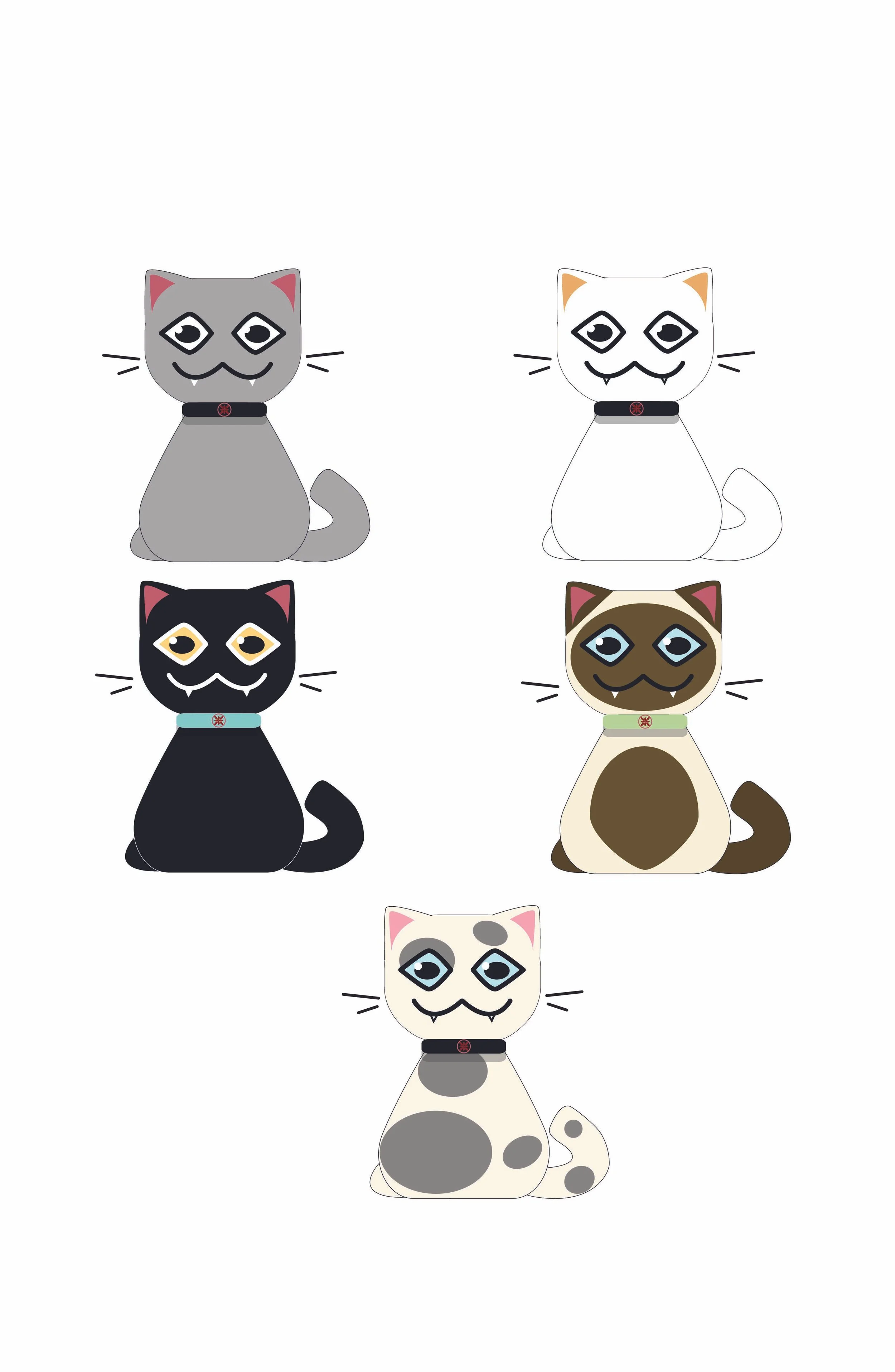
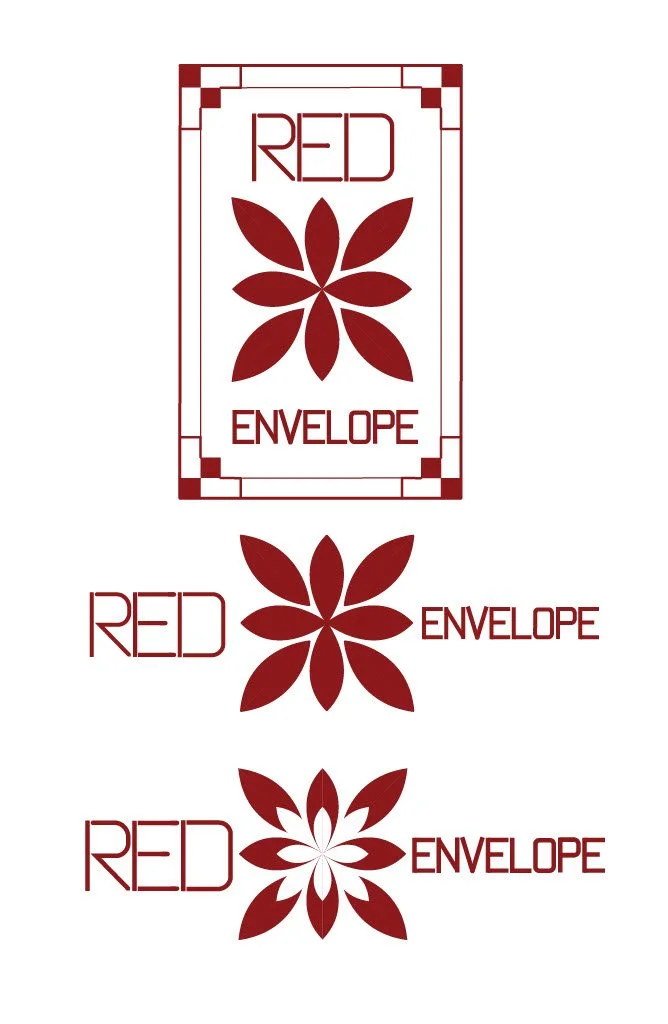
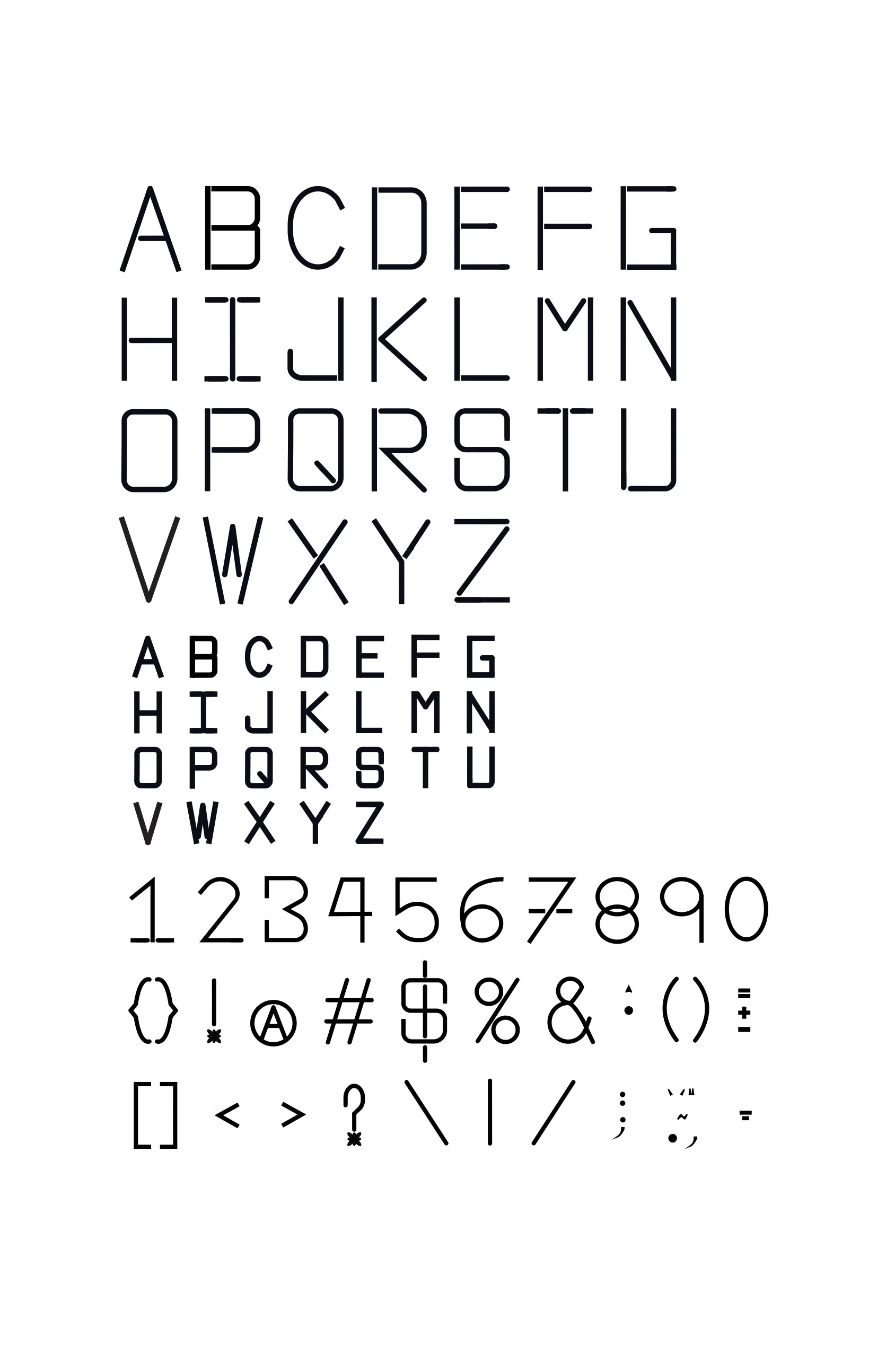
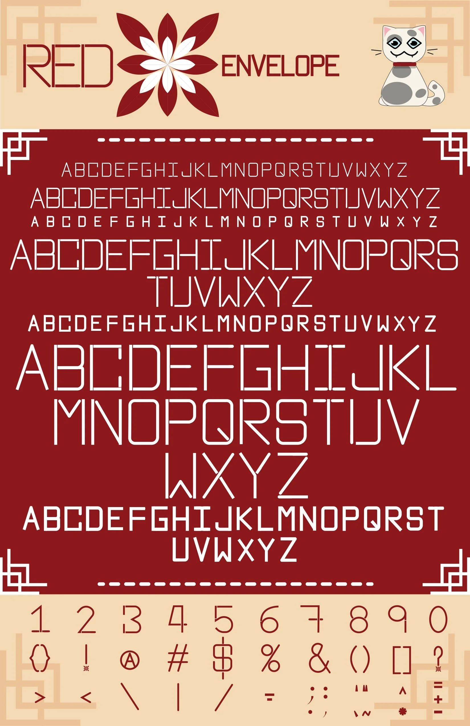
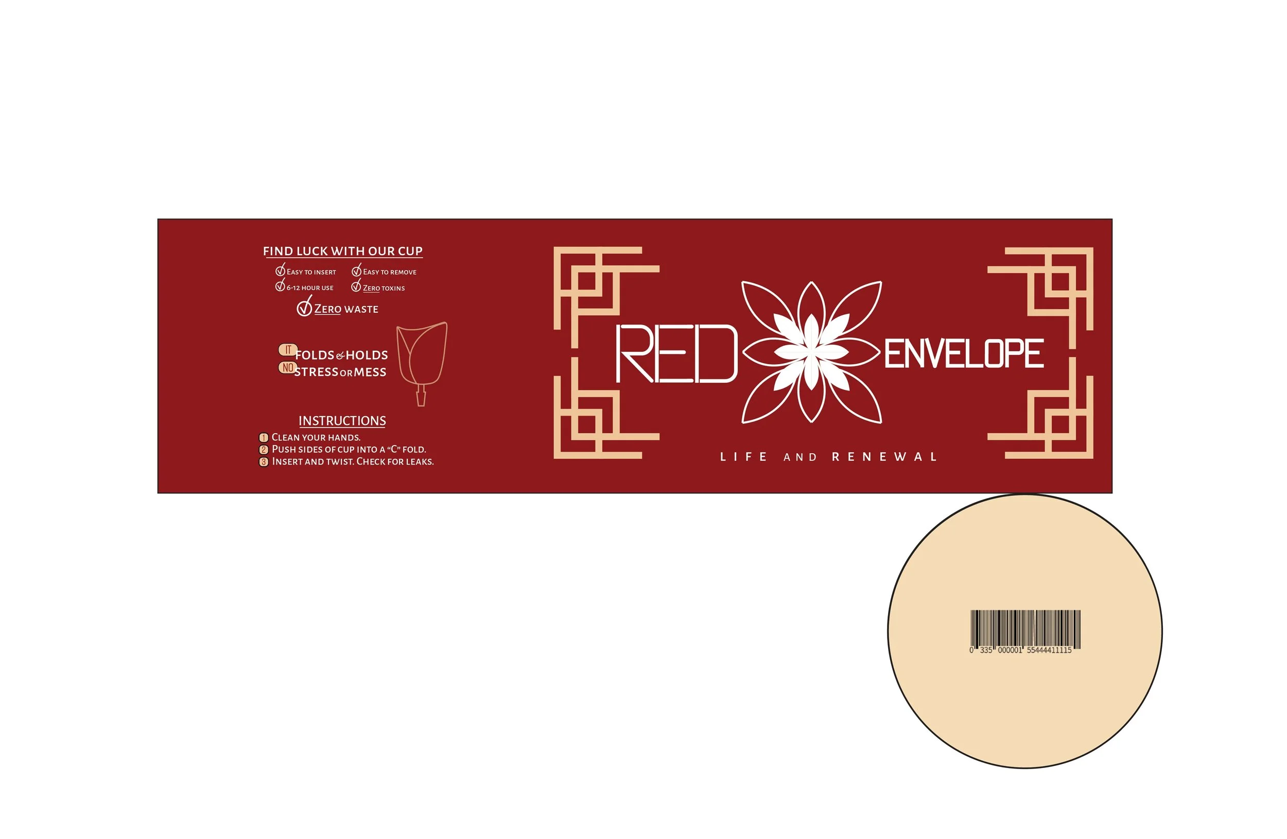
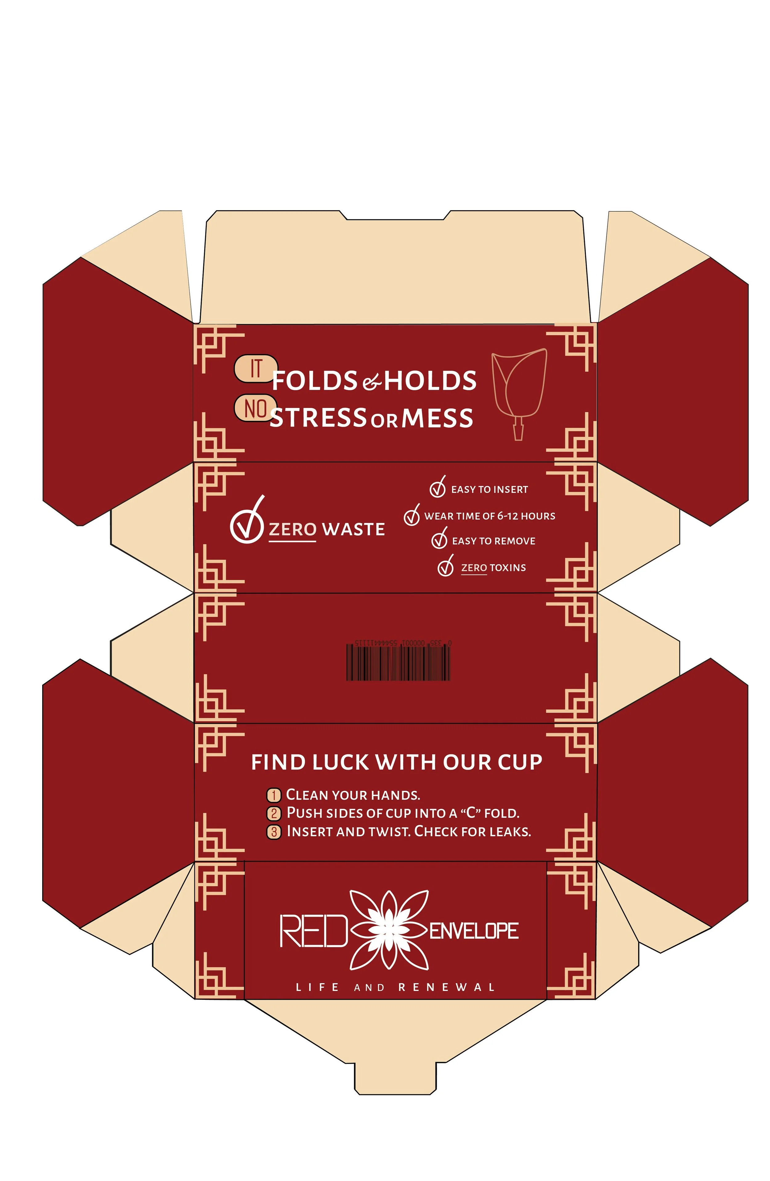
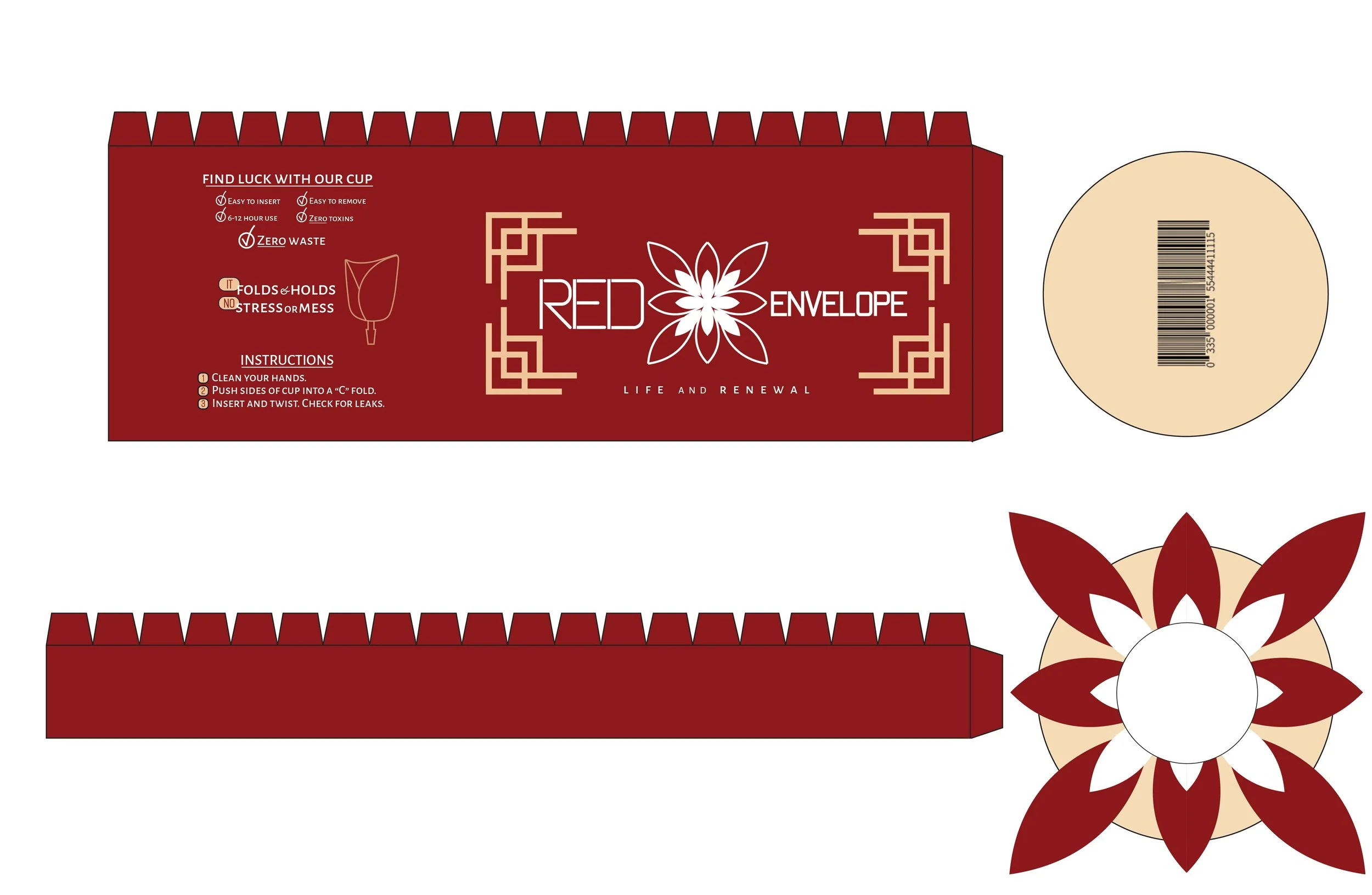
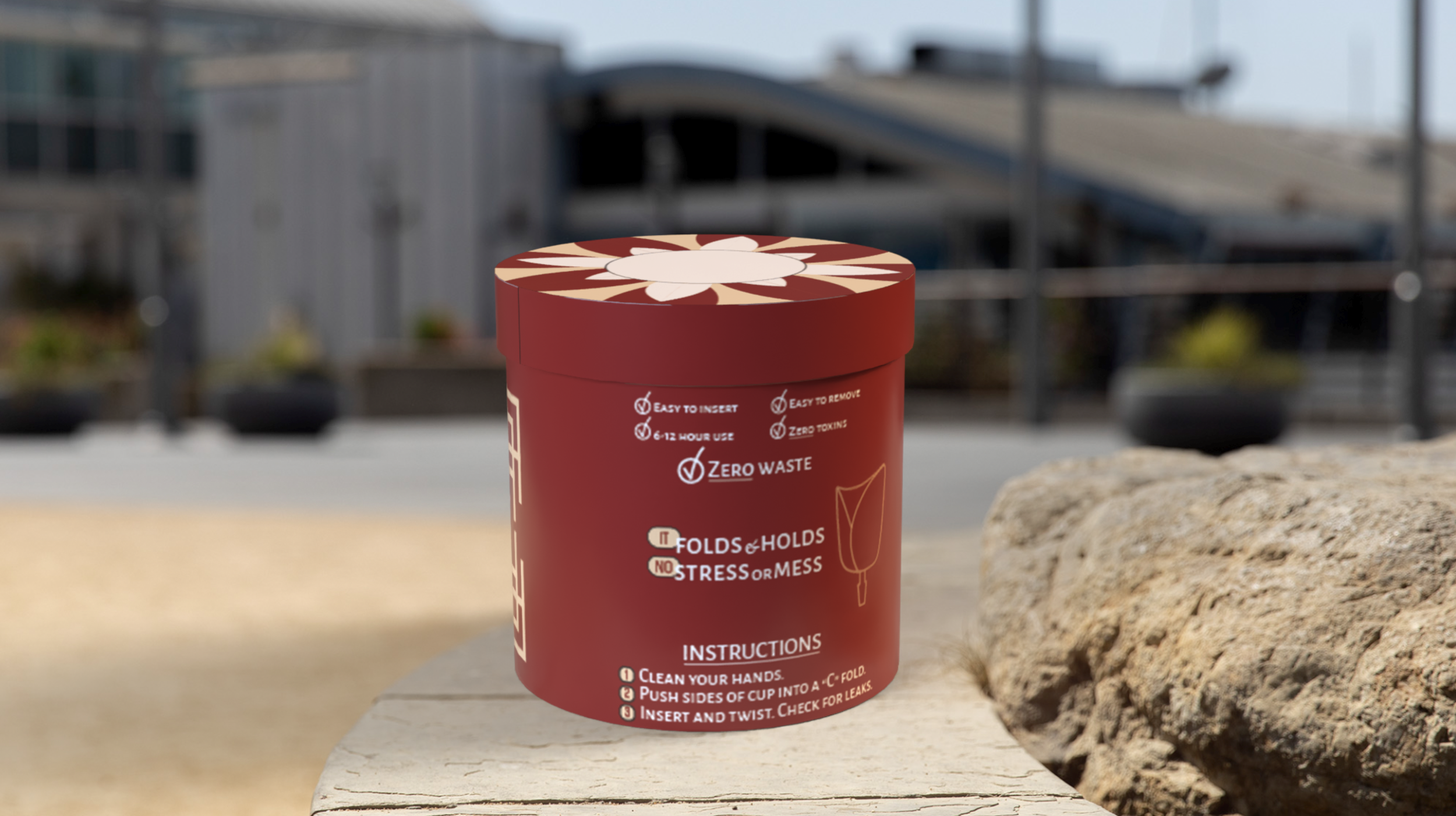
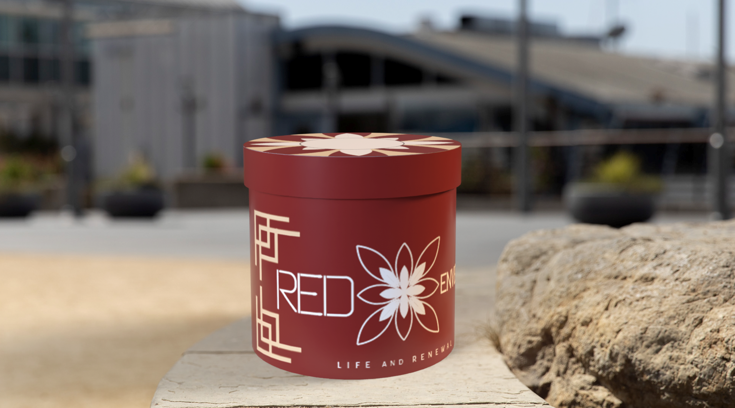
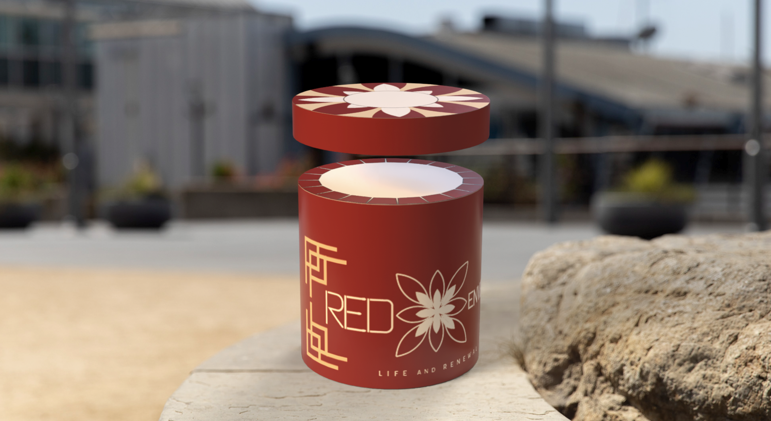
For the spec-sheet, when going through the design process, I worked hard on the font first. I went through a slight back and forth process, changing some small parts of lettering and numbers. Through the information we were given from the owner, I made sure to stick to the kind of fur color pattern she wanted for Envvy the Cat while applying him to the spec sheet. I then went through in designing my logo. My first couple of sketches were combined and switched around within Adobe Illustrator, until I settled on a design I thought would represent the lotus of Red Envelope while sticking to red and white to represent the "time of the month" for many women. I then would make my spec sheet, putting it together and going through a lot of back and forth. After settling on simpler designs, I then would incorporate more ornaments to further push the Asian element Red Envelope is unique in catering to. All in all, this product was made with Red Envelope in mind—using red to symbolize the blood, leaning into Asian elements, and making the look of it modern and sleek like the owner would have wanted. When going through the keyline design for Red Envelope, I wanted to incorporate the design of my Spec Sheet into it. The keylines were given to us by students of another art class. I kept leaning towards the red, to represent the idea of a period product while also incorporating accents and nods towards Asian designs. The taglines and information on the period product were incorporated using the information from the slides given to us by the owner, and I wanted to stay true to the purpose of her work. I changed the font to match more to the one that I made, and I used designs of the Red Envelope period cup to give the product a sleek yet modern look while staying unique to itself. As for the 3D mockup of the package, the product is readily available to be shown in 3D in a more accurate setting without necessarily impeding on the framework. While the 3D mockup gives off quite a bit of information, I wanted to show off the brand of Red Envelope through its style and color. I really considered the shape of the product to be important, because, more often than not, period cups are in circular containers. I wanted something unique for Red Envelope, and when looking down from above to peek through the lotus flower to see the product, it feels like you are getting a sense of the product while also sticking to the brands' identity.